Your vendor login page is often one of the first touchpoints for your marketplace partners. It’s very essential to make it look polished and consistent with your brand. With the WC Vendors Signup plugin, you don’t need to edit plugin files or write complicated code to achieve a professional design.
With a few lines of CSS, you can transform the default WC Vendors Login Form into a sleek, user-friendly interface that aligns perfectly with your site’s visual style.
Where to Add Custom CSS
You safely add the styling code below using one of the methods below:
1. Through the WordPress Customizer (Recommended)
- Navigate to Appearance → Customize → Additional CSS in your dashboard.
- Paste in the code and click Publish to see your changes instantly.
2. In a Child Theme
- If you’re using a child theme, open the
style.cssfile. - Add the CSS snippet there to ensures your customizations remain intact even after theme updates.
3. Using a Custom CSS Plugin
- Plugins such as WPCode Lite allow you to safely insert snippets without editing theme files.
- Just paste the code into your preferred code snippet plugin and save.
Custom CSS for the WC Vendors Signup Form
Use the following CSS to modernize the appearance of your WC Vendors Login Form. It styles the input fields, buttons, and links to create a cohesive, professional design.
How These Styles Transform Your Vendor Login Form
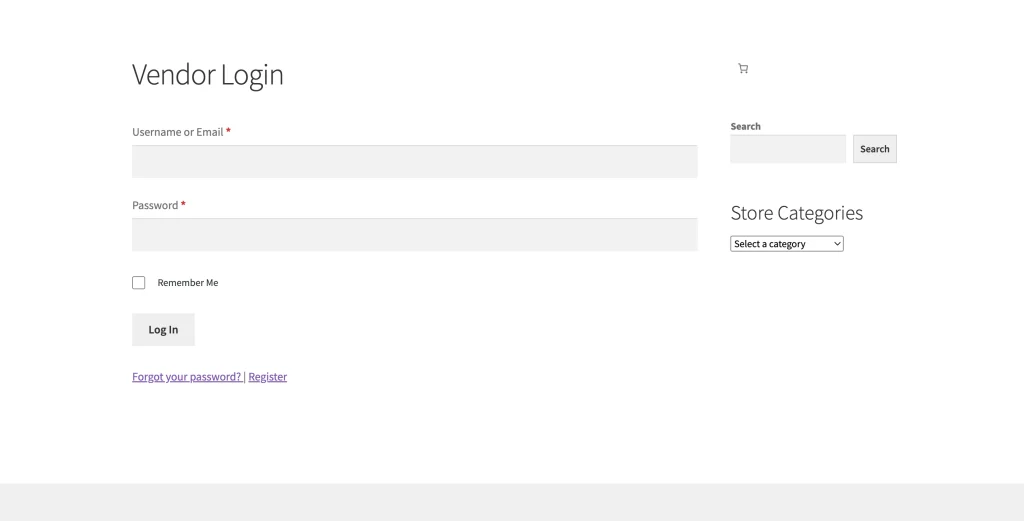
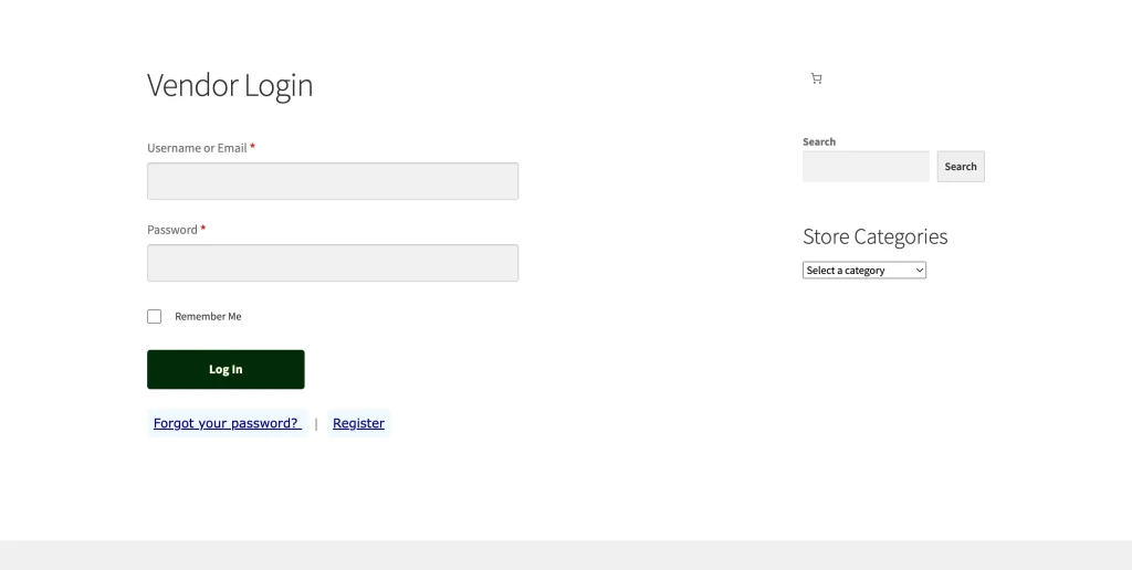
Once applied, this CSS gives your login page a cleaner, more cohesive look. Here’s what’s changed:
- Refined input fields: Smooth edges, neutral tones, and clear text for easy readability.
- Modern button design: A deep green background with soft yellow text and smooth hover transition.
- Readable links: Clear contrast between background and text, making password and register links stand out.
- Consistent typography: Verdana font keeps the design simple and accessible across browsers.
Your login page will feel more polished and welcoming. This improved design helps vendors log in with confidence.
Customize the Vendor Login Form to Match Your Branding
Make your vendor login page feel like part of your brand by adjusting the CSS:
- Colors: Update color codes (e.g.,
#00008B,#012b09) to match your brand palette. - Fonts: Replace the default font-family (e.g., Verdana) with your brand’s font to maintain consistent typography.
- Layout & Spacing: Adjust column gaps, margins, or font sizes to create a more compact or spacious form.
- Buttons & Hover Effects: Style buttons to match your brand colors and hover transitions.
These changes ensure the login form aligns visually with your marketplace, making it feel professional and cohesive.
Enhance Your Vendor Login Page Using Gutenberg Blocks
We recommend using Gutenberg page editor to add content and structure to your vendor login page beyond simple styling:
- Image: Use an Image block above the login form to showcase your marketplace logo or a custom banner.
- Welcome Message: Add a Heading or Paragraph block to greet vendors and introduce your brand voice.
- Helpful Links: Use a List block to include links to your Help Center, support contact info, or password tips.
- Structure & Readability: Add Spacer or Separator blocks to organize sections and improve readability.
- Call-to-Action: Add a Button or Call-to-Action block linking to your vendor registration page, styled with your brand colors.
Preview Your Changes
Check out the difference these customizations can make on your Vendor Login Form
By styling your login form with CSS, you can create a professional, on-brand experience that immediately reflects your marketplace’s identity and makes vendors feel confident and welcome.

